

My Role
- Research & Analysis
- Ideation
- Wireframes & Prototypes
- User Testing & Iterations
- Visual Design
Project Specs
- Timeframe: 3 weeks
- Tools: Sketch, Omnigraffle, Adobe CC, Invision
Young Women Social Entrepreneurs
Young Women Social Entrepreneurs (YWSE) serves women with a socially conscious agenda who are founders and leaders within businesses, non-profits, and government organizations. As of 2012 there are 7 chapters within the US and 5 internationally. The New York Chapter of YWSE (NYWSE) was founded in 2008. YWSE aims to provide its community with the necessary tools, training, and resources in order to succeed as business leaders while becoming sustainability experts. They empower people to effect change in society at all levels: as individuals, community members, professionals, students, and entrepreneurs.
Project Overview
The New York Chapter of YWSE needed UX designers to create a website that monetizes membership services in an effort to create lasting financial stability for the chapter. Due to an uncertainty of leadership on the national level, a secondary goal included separating its brand visually from the YWSE master brand.
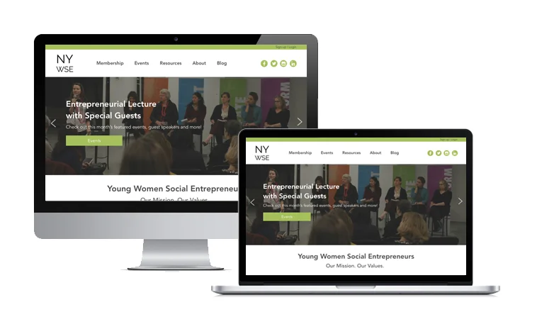
The website for the New York Chapter of YWSE will be the platform where chapter members can create profiles, connect with other members, and have access to dozens of chapter-provided resources.
Research
Competitive & Comparative Analysis


Competitive Landscape
By evaluating various membership based organizations, we developed a better understanding of the competitive landscape. We wanted to know what benefits exist for paid and free memberships, as well the different kinds of elements existing on various pages throughout the site(s).
Feature Comparison
We compared various paid and free membership-based websites and their features. Important features included:
- Clear Membership Benefits
- Social Media Integration
- Bold Headline/Site Title
- Join/Login on homepage
User Flows
In order to ensure the user has a seamless experience, we created user flows from competitors websites. Our goal was ensuring the site had the least amount of steps necessary to accomplish user tasks, such as accessing the membership directory.
Takeaways
AIGA was a great example of showcasing paid memberships with several tiers. The cost of each membership was clearly displayed with its associated benefits.
Surveys & Interviews
Our primary user group were young professionals between the ages of 25-31. The majority of people surveys attended networking events at least once a month and 75% were already members of other networking groups/organizations.


We surveyed 41 people and conducted 9 user interviews with students, educators, employed and unemployed professionals.
We discovered that:
- they desire excess membership perks for the cost
- users are typically looking for job opportunities
- they dislike non-profits that lack transparency
- users need to be sure they're joining a reputable organization
Synthesizing data
Affinity mapping was an essential method for understanding user needs. We wrote down insights from each interview on sticky notes and grouped them together based on similarities. As trends emerged, we felt confident prioritizing site features. Some of the patterns that emerged were:
- Want for exclusive membership perks (spotlight, acknowledgement, profile, directory, curated content)
- A need for social media sharing
- Receive email newsletters
- A resourceful page (tools, contacts, articles, relevant news)
- Users want to be reassured that they’re joining a reputable organization (stats, partnerships, clear mission, values, etc.)
- Many expressed the importance of attending networking events, workshops, and classes
- There is a need for efficient signup using other social media platforms
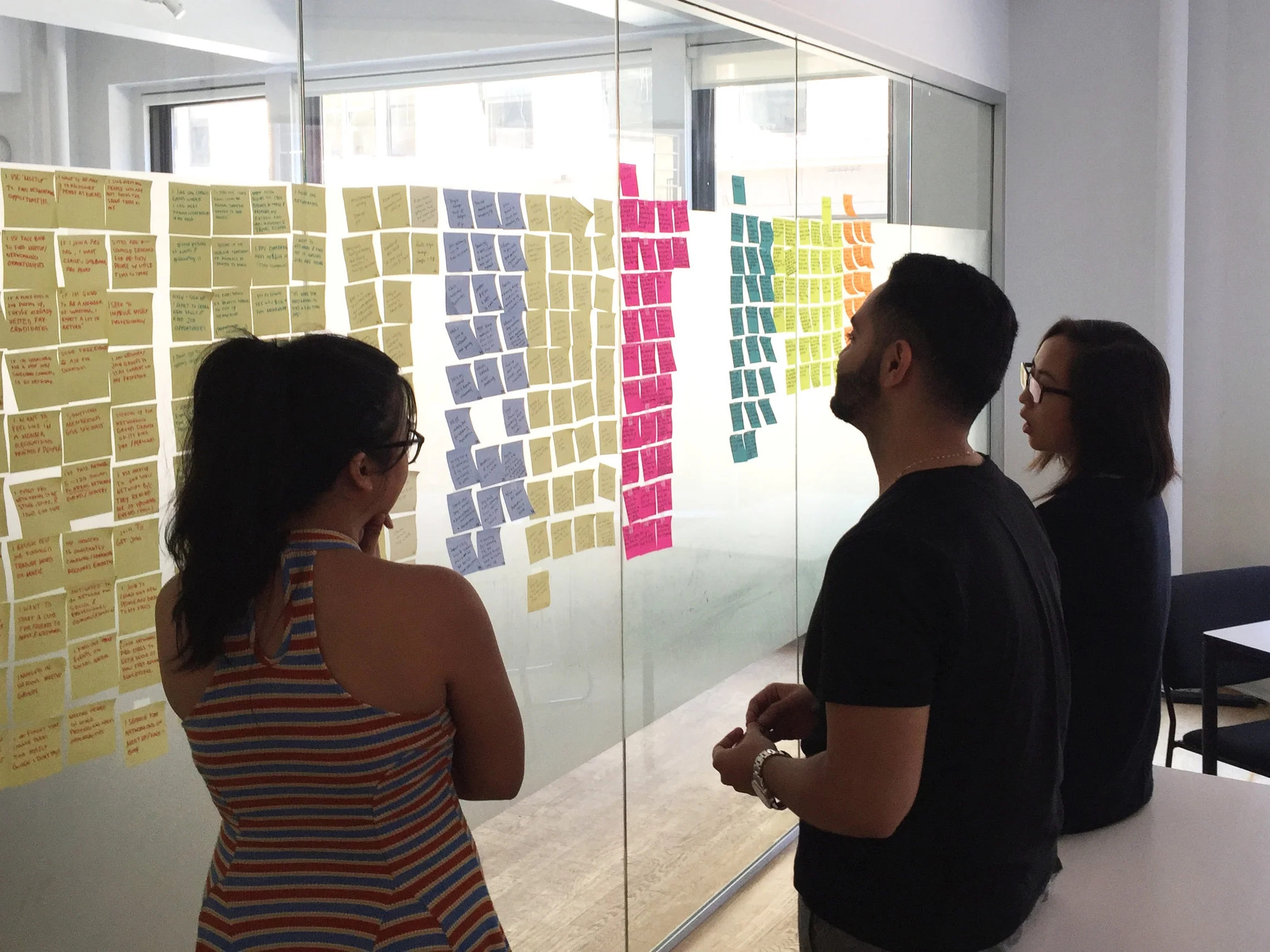
Before Synthesis

After synthesis
Takeaways:
- Users need to see brand affiliates on the home page
- Attending sponsored events are critically important
- There's an expectation of member resources
Personas
After synthesizing data, we crafted personas to better visualize the user and empathize with their needs, wants, and pain points. We crafted 3 personas based on 41 survey responses and 9 user interviews.


Feature Ideation & Prioritization
Insights from affinity mapping helped determine which features to include in an MVP website for the New York chapter of YWSE.

Why:
- Provide tools for members to advance in their business and careers
- Get in touch and stay connected with members throughout the chapter
- Share events, articles, contacts with friends, colleagues, or family
- Opportunities to network, connect, learn and grow
Initial Features:
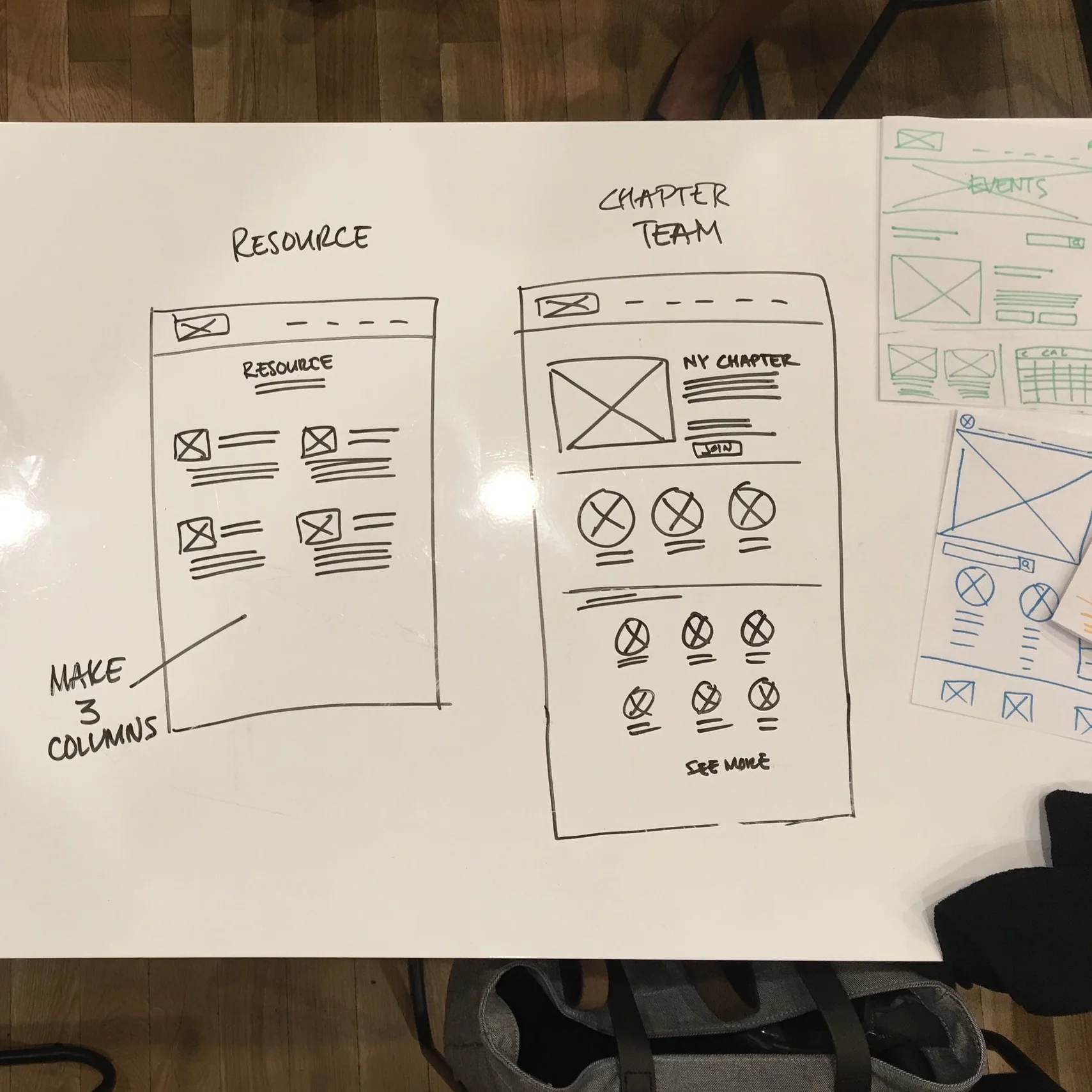
- Resources
- Membership Directory
- Social Media Sharing
- Featured Events
We had to prioritize features for our MVP (minimum viable product). We created a matrix of impact versus expectations in order to better understand which features our end users needed first. We also used the MoSCoW method of feature prioritization to determine which features we must have, as well as features the app should have, could and won't.
Stats about money expenditure, clear mission statements and social media login were 3 of the top must-have features following these two feature-prioritization methods. Stats about money was later substituted for affiliate logos as it had a similar functionality for the end user and was easier for the client to disclose.
Ideation, Wireframes & user testing
The New York chapter of YWSE had a live work-in-progress website but having done independent research, we determined that starting from the ground up would be the best. We knew what features we needed to include to cater directly to users. In order to implement the features, we had several brainstorming sessions involving the entire team.


User Testing
We tested our low fidelity prototypes with 5 users to review the functionality of the website before spending time on high fidelity mock ups. We specifically tested the navigation menu, information architecture and the corresponding pages.

Initial findings
Users expressed confusion at the 'Login | Sign-up' link at the upper left corner of the home page and its relationship to the circles which would become social media icons. Users also expressed confusion as to why 'Login' and 'Signup' forms were both located on the same page after clicking on the link. When it came to the Events page, Users wanted to see more than 1 featured event and a way to filter events by dates. Despite the plethora of comments most users found their way around the site very well, so we committed to the main navigation for the next iteration. We determined that a lot of users had trouble with understanding the page content with the lower fidelity comps. We decided to resolve the common issues discovered during initial testing with low fidelity and re-test the prototype before moving into higher fidelity.
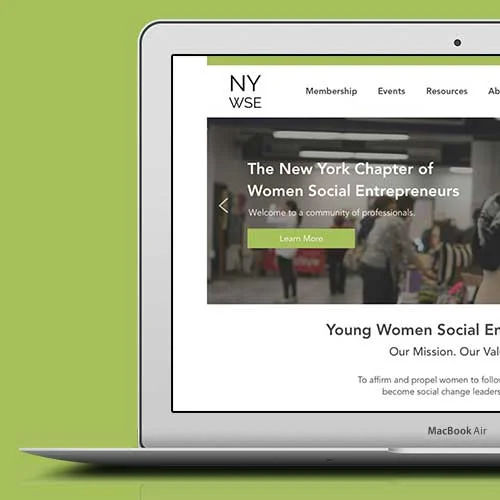
Low/Medium Fidelity Wireframe


High Fidelity Mockup
After testing additional users with intermediate iterations to resolve initial issues, we moved on to high fidelity wire frames.


Prototype
Annotated High Fidelity Wire frames


Similar Projects

Waze

Fandango

Strand Books
Rapid Prototype