

My Role
- Project Management
- Research & Analysis
- Art Direction
- Presentation Design
- Visual Design
Project Specs
- Timeframe: 2 weeks
- Tools: Sketch, Omnigraffle,
Adobe CC, Invision
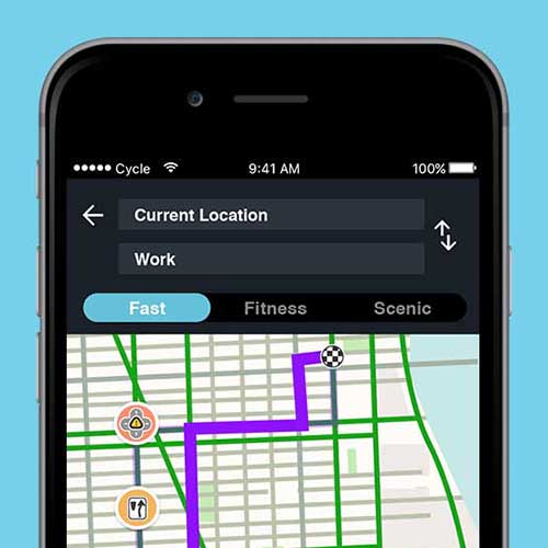
Waze
"Waze is the world's largest community-based traffic and navigation app. [It works by joining] other drivers in your area who share real-time traffic and road info, saving everyone time and gas money on their daily commute." - waze
Overview
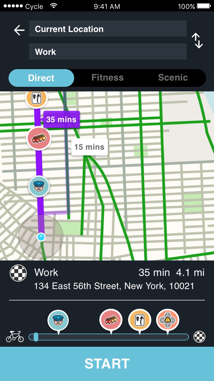
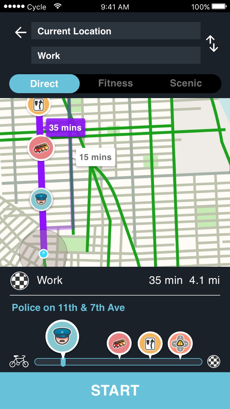
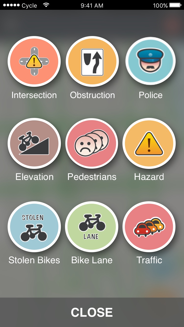
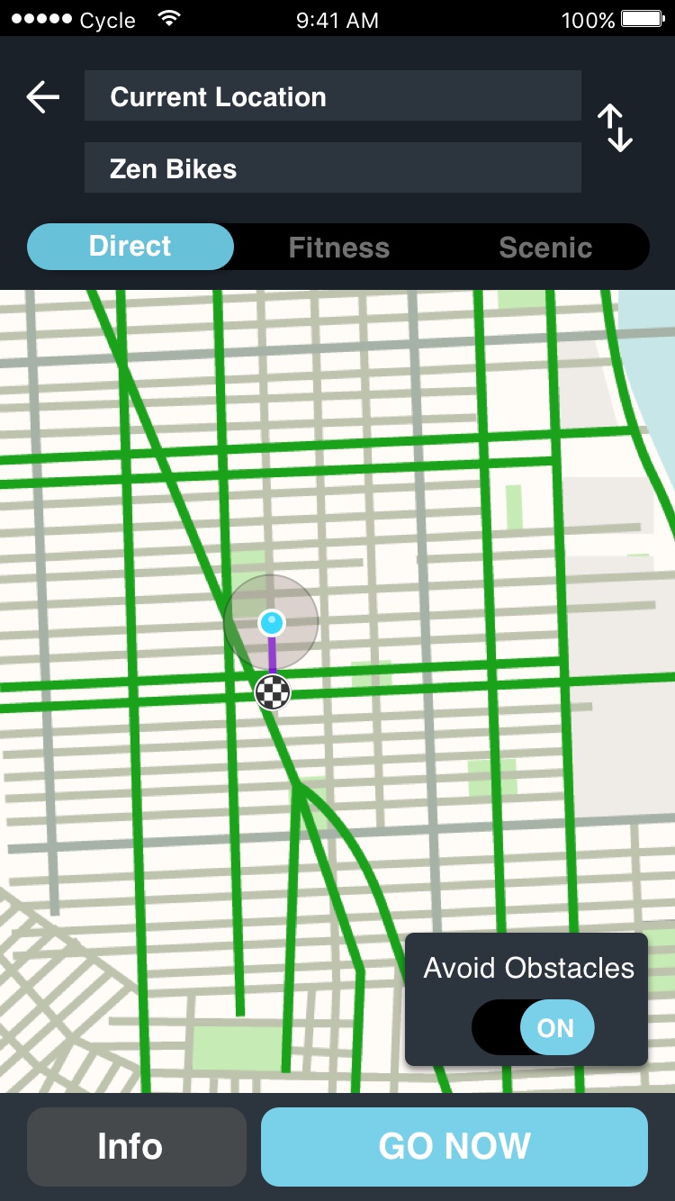
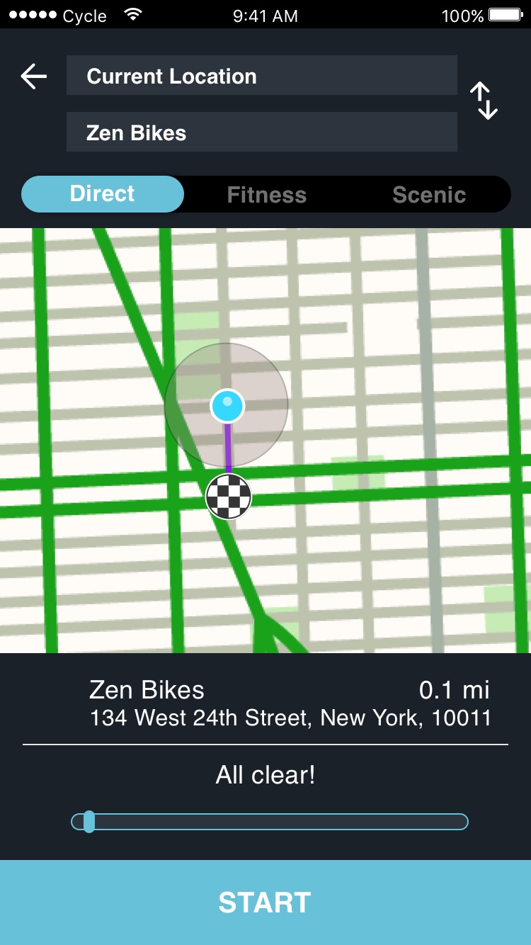
Cyclists are often subjected to many of the same roads and regulations as drivers, yet their vehicles are ill-equipped to handle many of the same road conditions. Existing cycling apps focus primarily on athletic performance or ride-sharing but not navigation. Those apps which do offer cyclists navigation fail at highlighting road construction or conditions in detail. Using Waze's platform, we have the opportunity to create a real-time GPS system for commuter cyclists while prioritizing bike lanes and reporting real time potholes, construction sites and dangerous intersections.
Research
Competitive & Comparative Analysis
Competitive Landscape
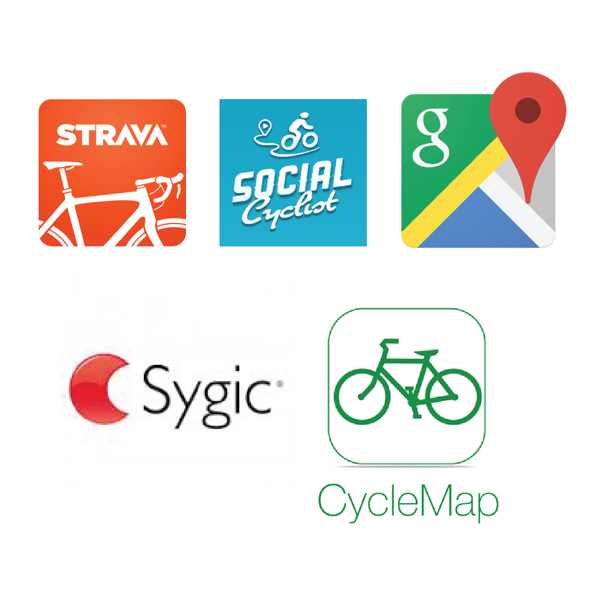


By evaluating top rated cycling and navigation apps, we developed a better understanding of the competitive landscape. We wanted to know why these apps were top rated and how they're used by actual users.
Feature Comparison
We compared various cycling and navigation apps and their features. Important features included:
- google maps integration
- search bar for setting address
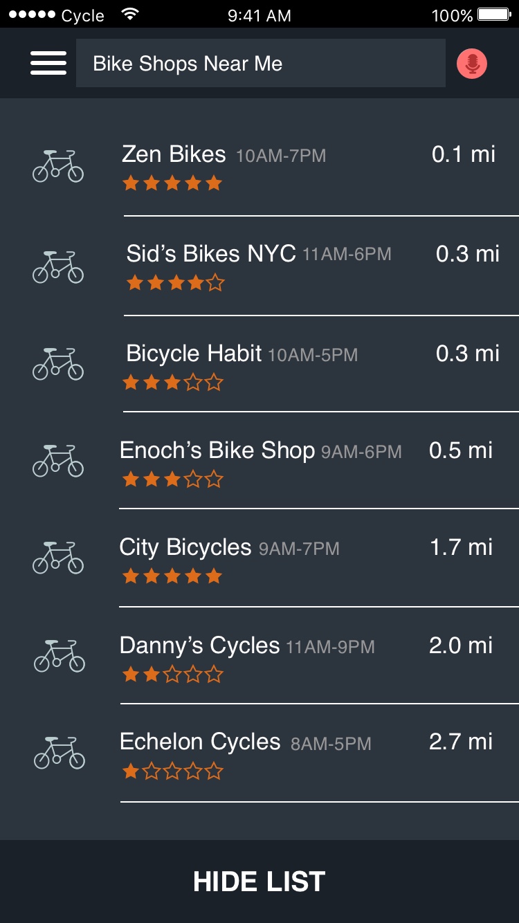
- bike shop / landmark locations
- audio feedback
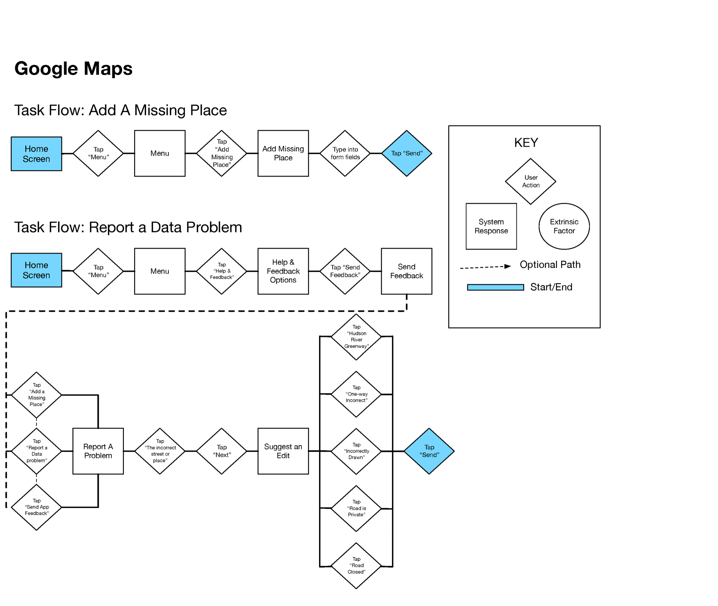
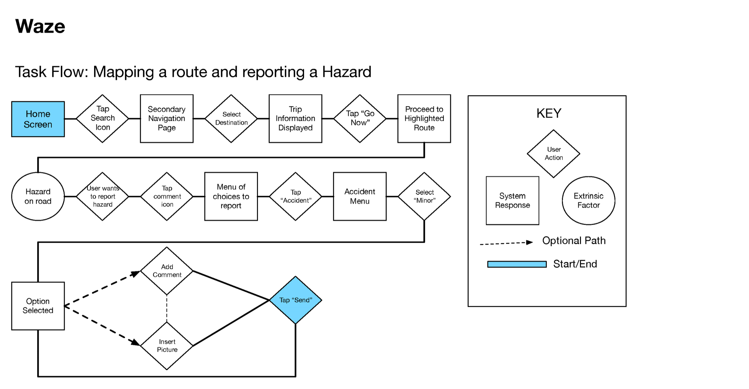
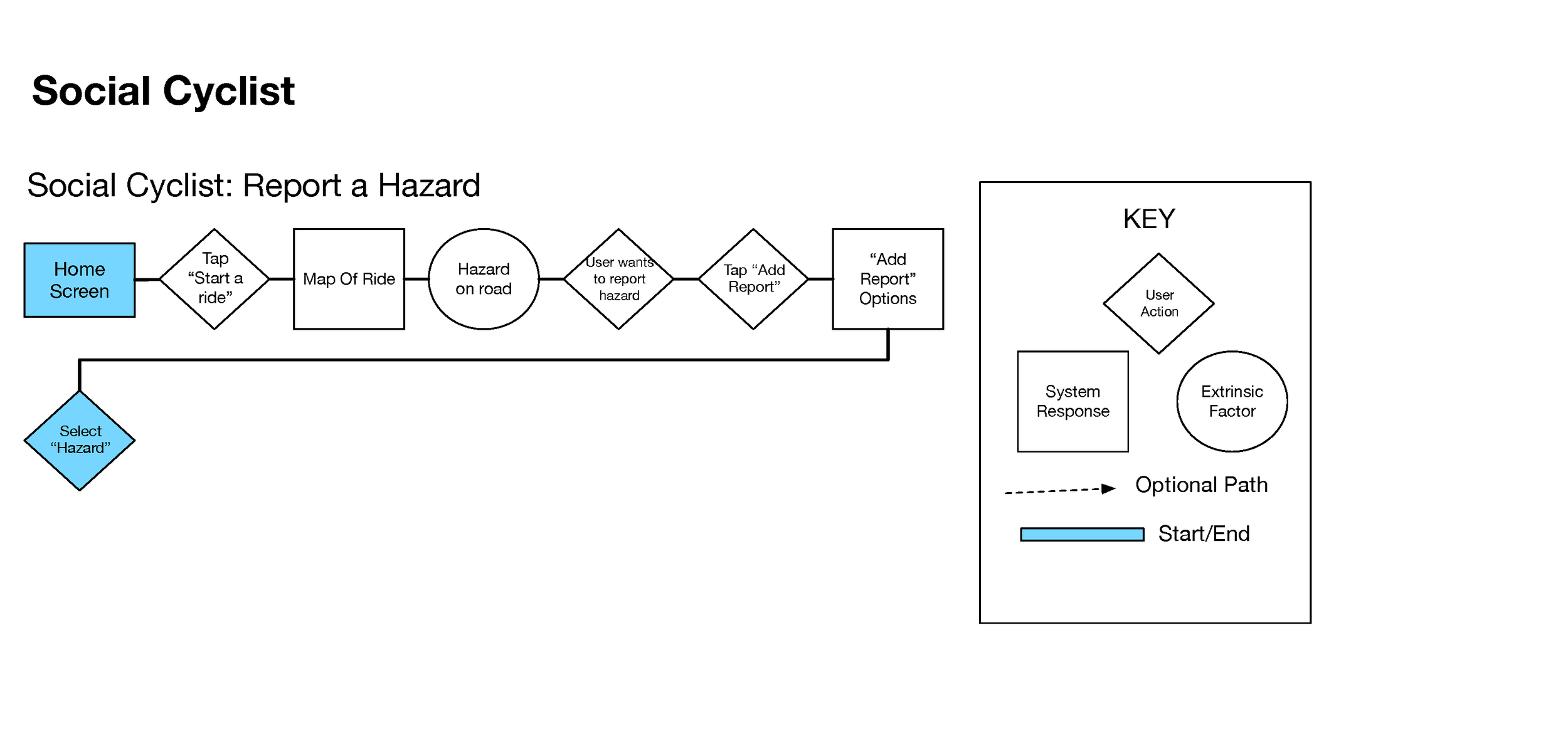
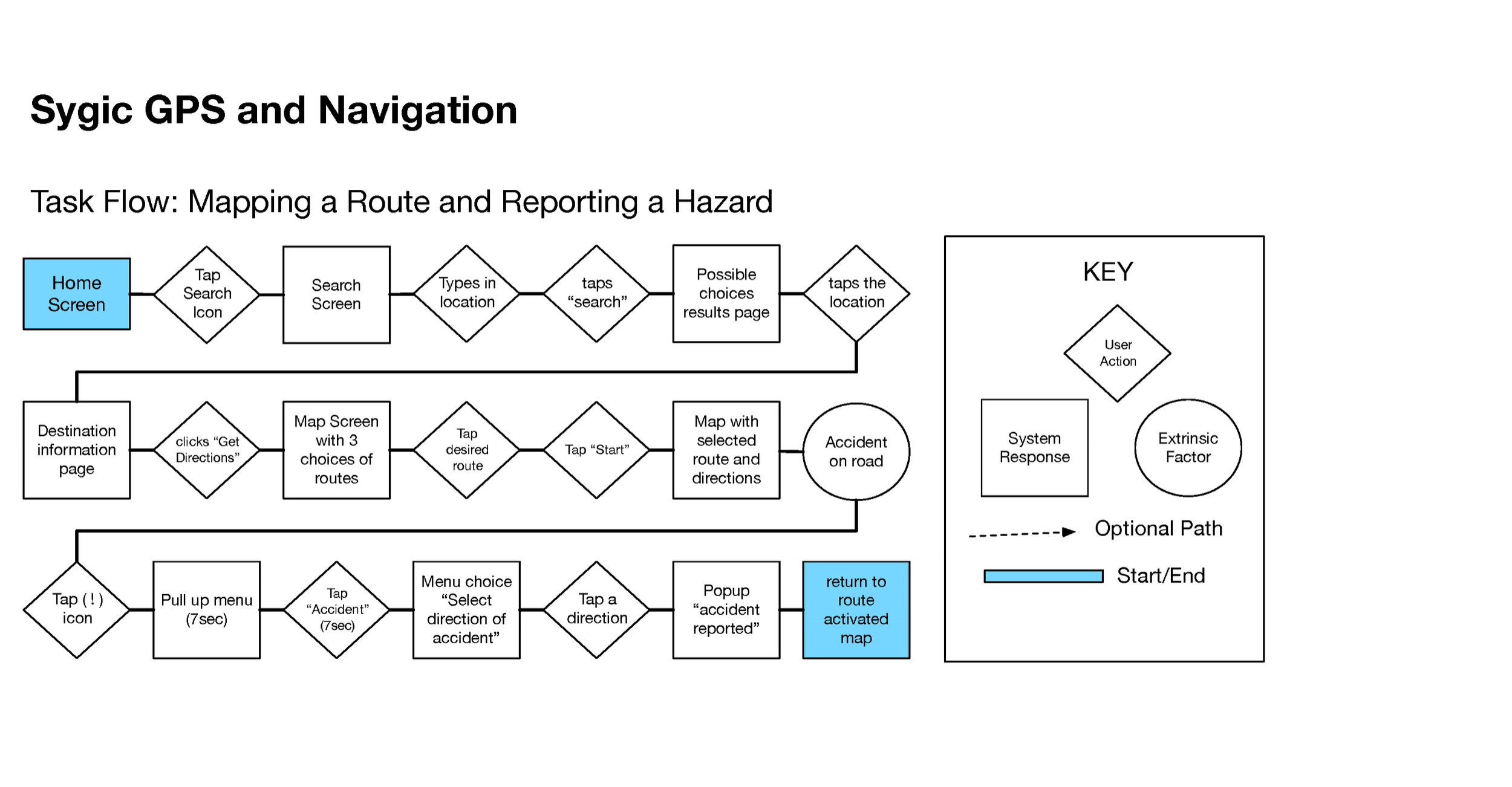
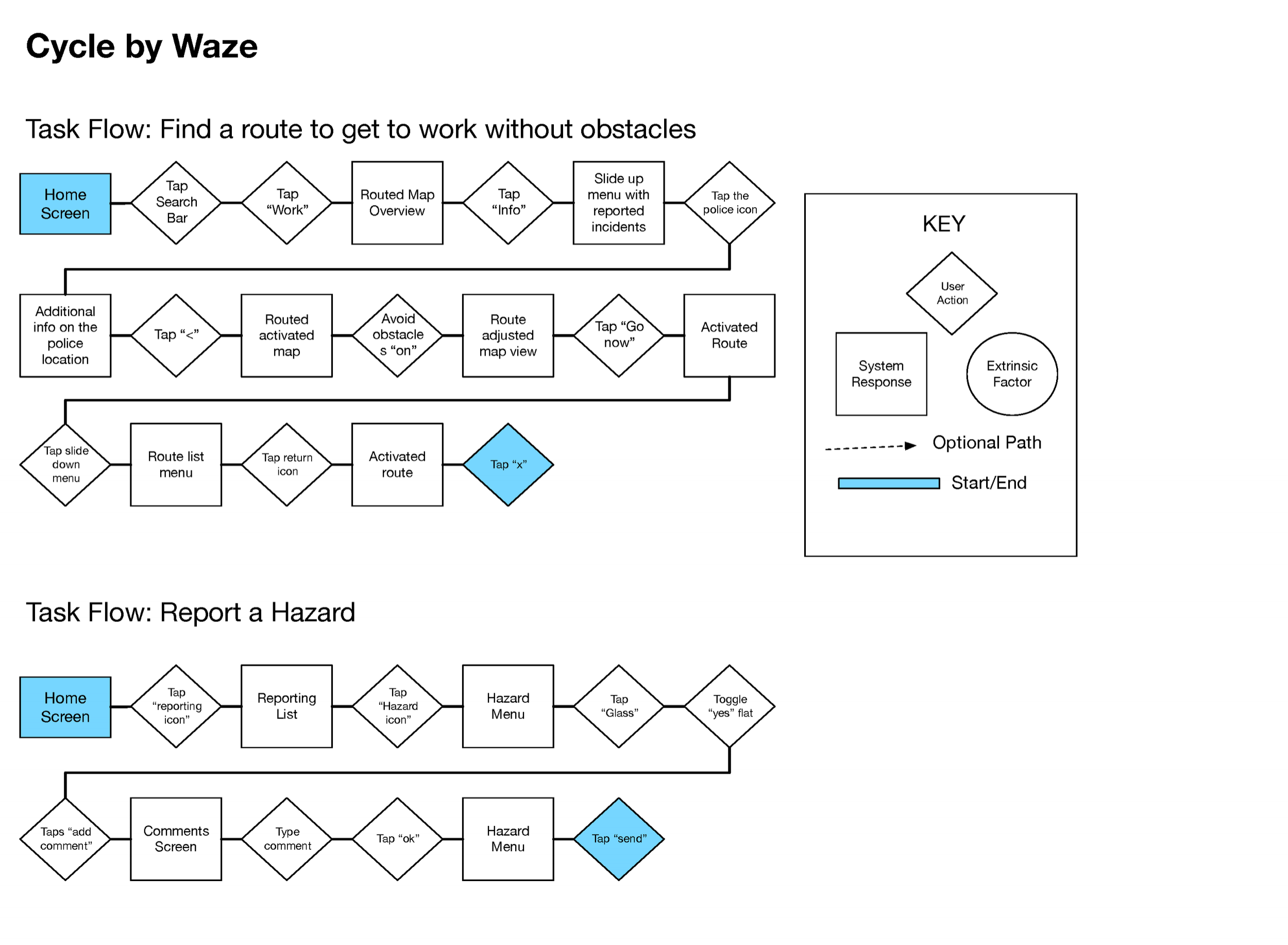
User Flows
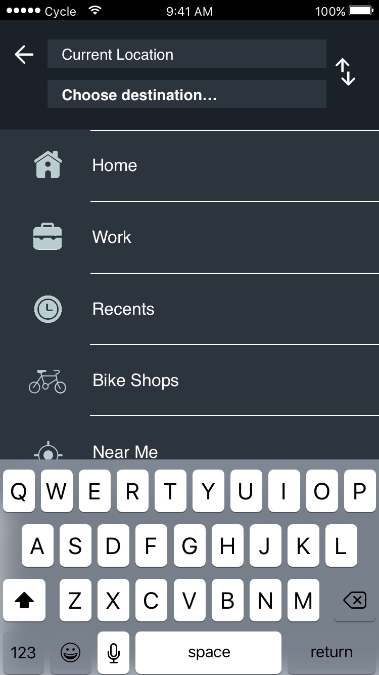
In order to ensure the user has a seamless experience, we created user flows from similar mobile apps. Our goal was ensuring the app had the least amount of steps necessary to accomplish user tasks such as mapping a route.
Takeaways
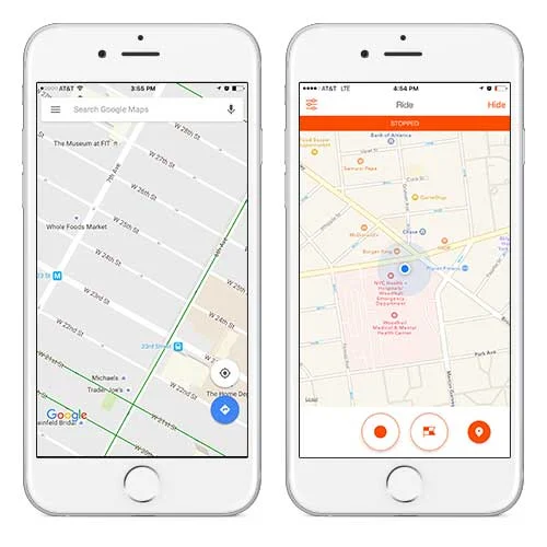
Google maps was by far the most-used apps by cyclists that responded to our survey and the favorite of every user we interviewed. This insight led us to prioritize google maps control-mapping over waze's, in an effort to make the app easily learnable.
Surveys & Interviews

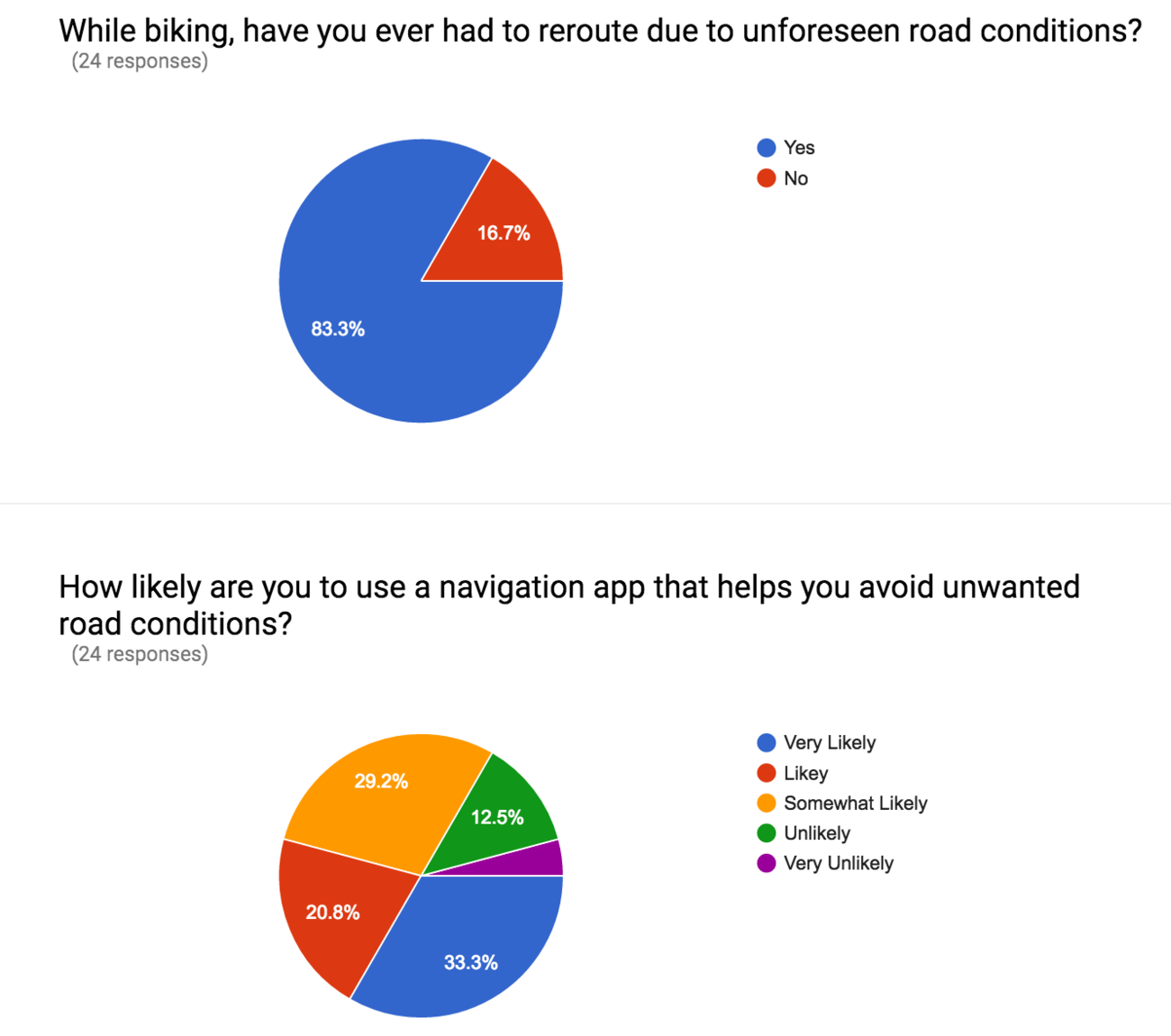


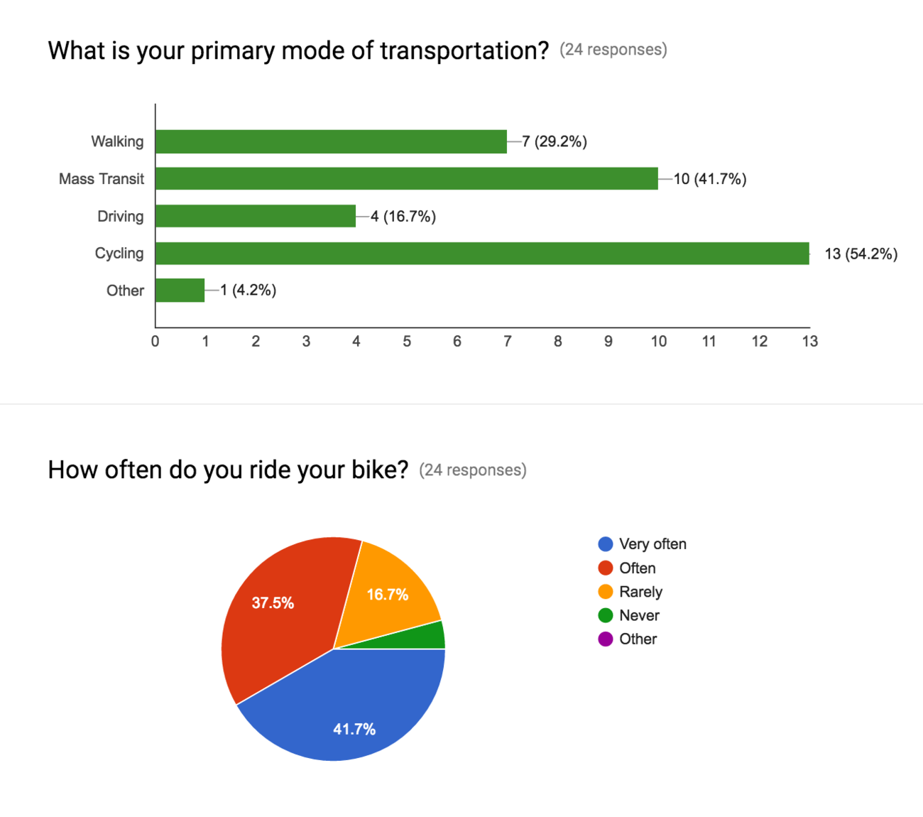
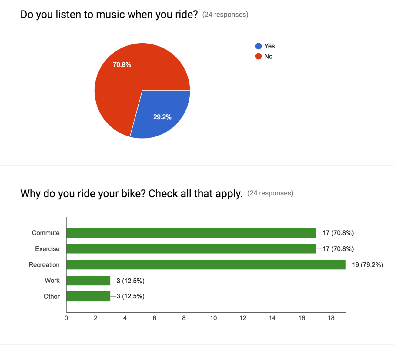
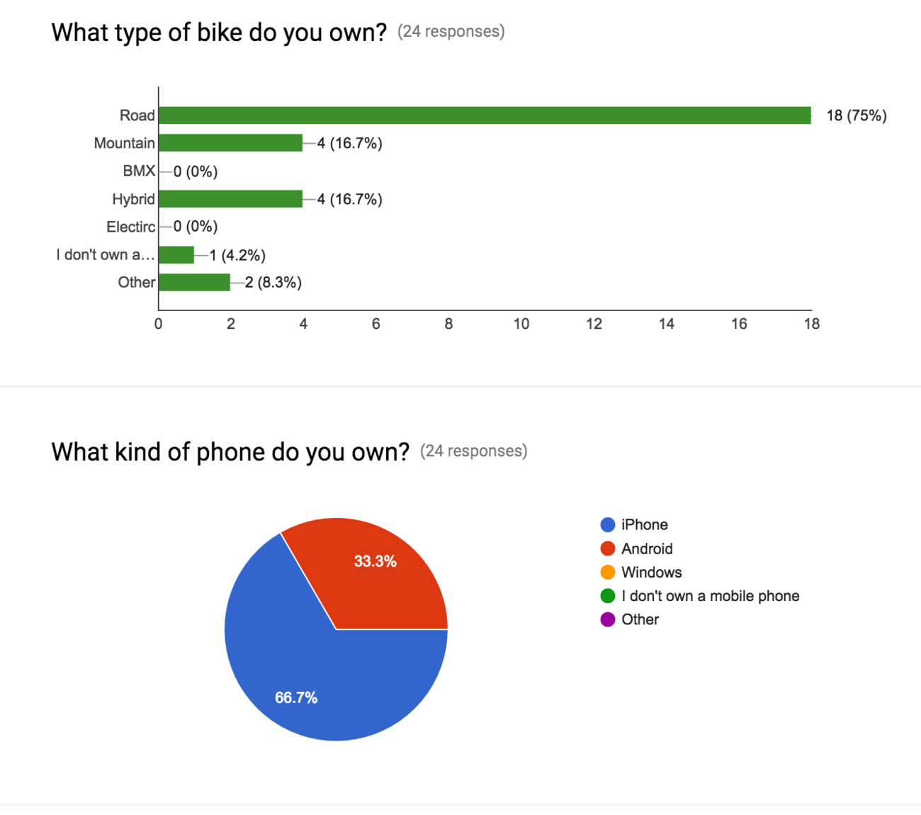

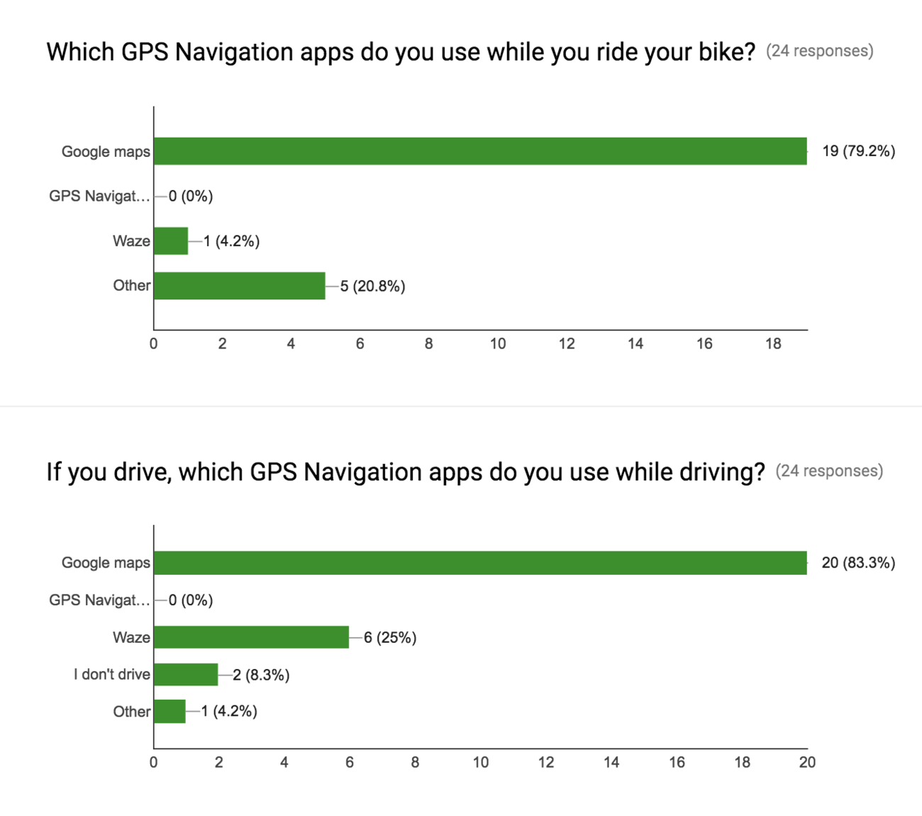
We surveyed 24 people and interviewed 8, with a distribution of commuters and recreational cyclists. We knew that our primary users were commuters. We wanted to better understand the context around cycling and their use of GPS navigation. Below are highlights of generative data gathered from our initial screener survey (left) which greatly impacted our design efforts.
- 66.7% of participants own iPhones
- Most users use google maps
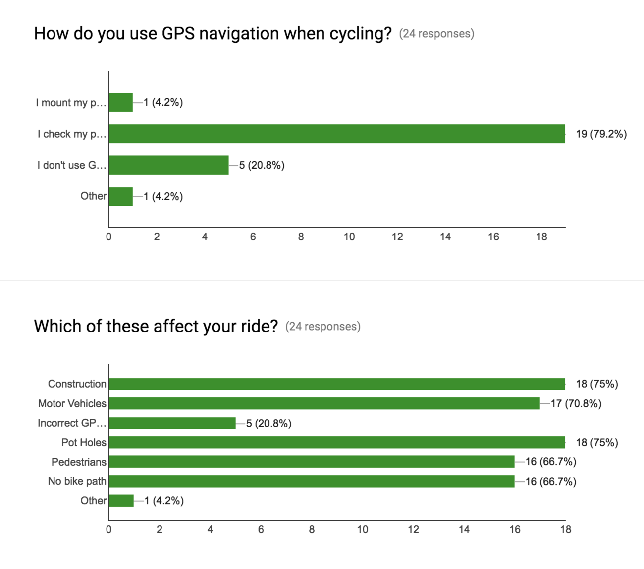
- Users tend to check their phone when forced to stop (traffic light, obstacles, forgotten route)
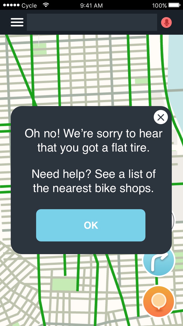
- Most users cited road construction and potholes as the primary reason they needed to re-route or deviate from bike paths
- Users try and memorize their route before they begin their ride and typically store their phone for safety
Synthesizing Data
Affinity mapping is an essential method for understanding user needs. We wrote down insights from each interview on sticky notes and grouped them together based on similarities. As trends emerged, we felt confident prioritizing site features. Some of the patterns that emerged were:
Behaviors
- Map route before ride
- Listens to audio directions on google maps via headphones
- Keeps cell phone in backpack while cycling
- Informs other commuter cyclists of police traps
- Prefers to cycle on bike lanes
Contexts
- Checks phone if they forget route mid-ride
- Some only commute on bike if there are protected bike lanes
- Some rode often in rural areas but stopped completely when living in the city
Pains
- Hate stopping to check phone
- Believe pedestrians are greatest danger
- Obstruction of bike lane (construction, cars/trucks, debris)
- Lack of bike lanes
Pleasures
- Simplicity & Ease of google maps
- Audio GPS feedback
- Long rides for fun
- Direct routes for commuting
- Protected bike lanes

insights from 8 Users sorted into 4 categories (Pain, Pleasure, BEHAVIOR, Context)

Same group of insights synthesized further into smaller groups
Takeaways:
- Cyclists feel safer when more cyclists are on a route
- Drivers don't look out for cyclists in large cities, the way they do in small towns
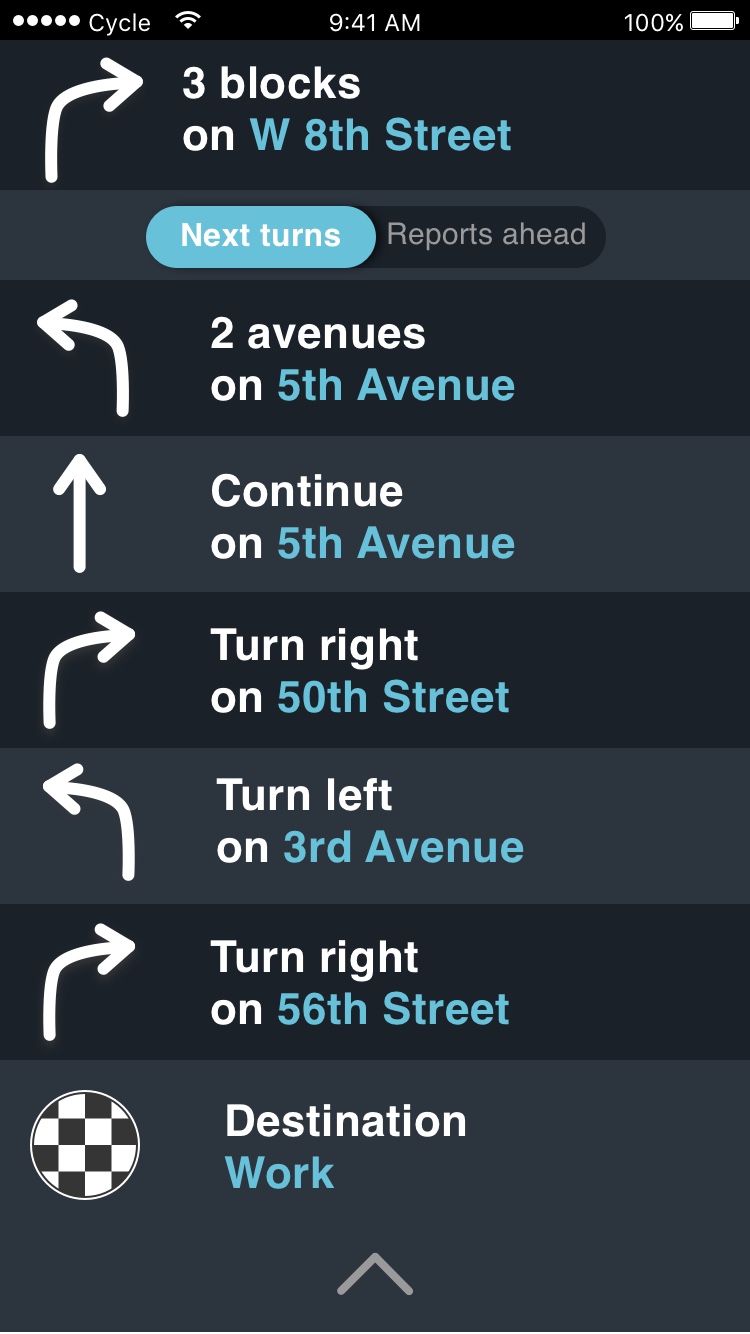
- They like vocalized navigation directions signaling the next turn, and the one right after
- Protected bike lane locations are important
- Cyclists could benefit from advanced knowledge of obstacles along the route


Personas
After synthesizing data, we crafted personas to better visualize the user and empathize with their needs, wants, and pain points. We crafted 3 personas based on 24 survey responses and 8 user interviews.
Feature Ideation & Prioritization
Insights from affinity mapping helped determine which features to include in this Waze app. After having done competitive business analysis and interviewing a few users, we had a clear sense of the kinds of features were both desired and expected from a product like Cycle by Waze. We utilized two feature prioritization methods in order to develop an MVP (minimum viable product).
Why:
- Cycle by Waze is a sister-app to Waze. It should highlight ideal bike routes over street routes by default.
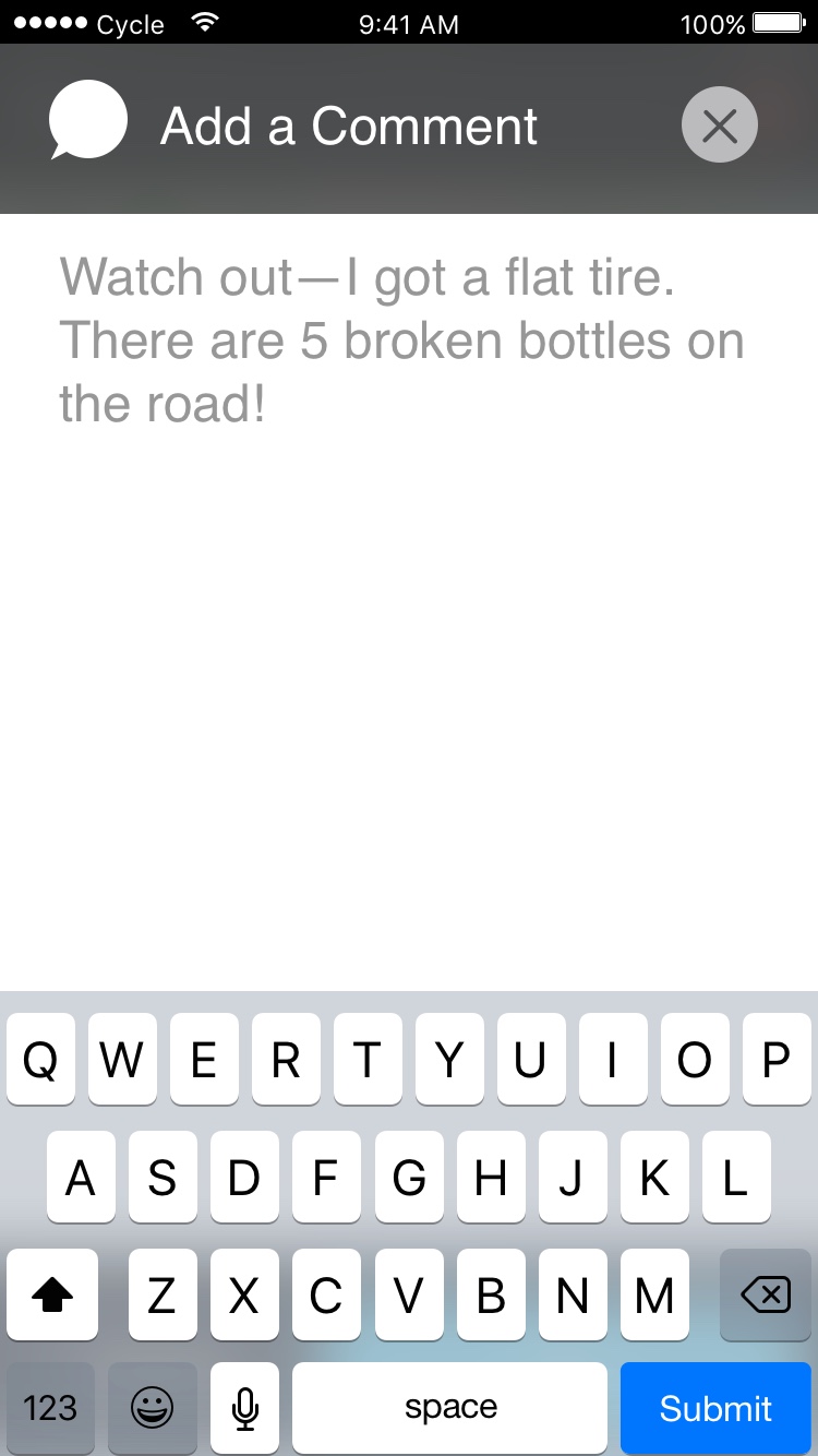
- Cyclists all expressed frustration with unforeseen obstacles on their regular routes. Waze reporting can mitigate the frustration by providing alternate routes.
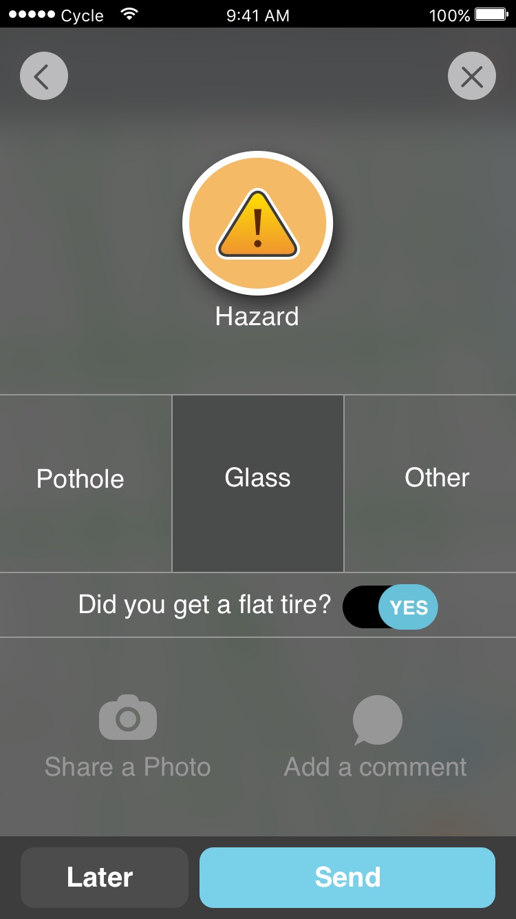
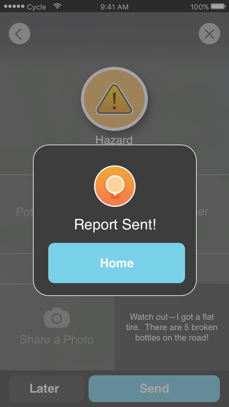
- Reporting issues allows the cyclists to update routes in real time
- Providing different route options based on user preferences
- Giving users an estimate of travel time is highly expected
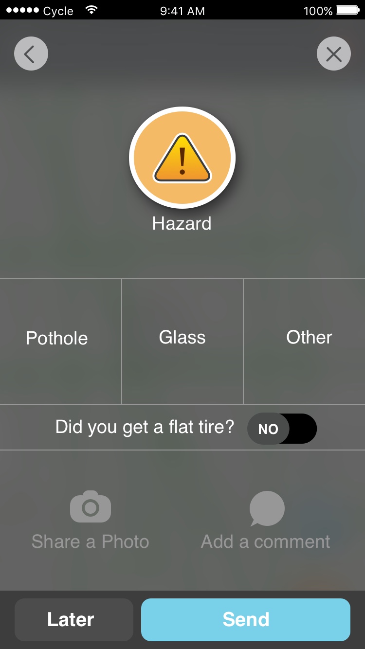
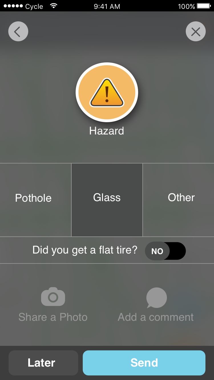
Initial Features:
- Bike routes
- Route overview
- Ability to report route issues
- Route options
- ETA
2x2 Matrix plot used for feature prioritization along an axis of user impact vs expectation.
MoSCoW feature prioritization method.
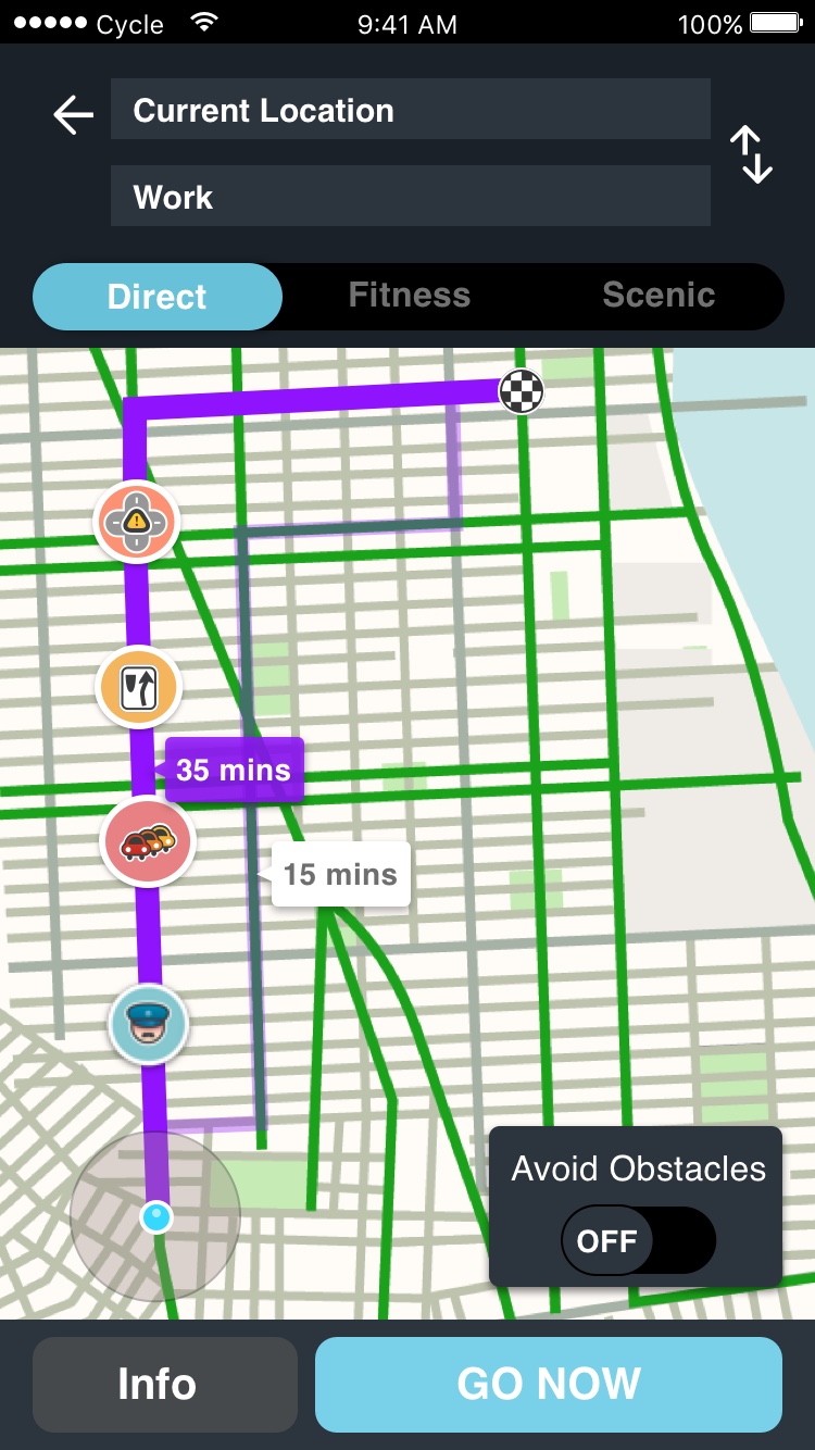
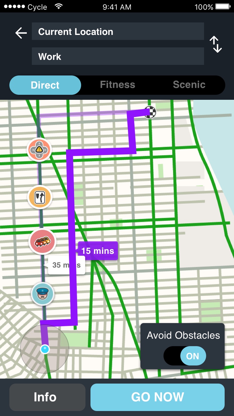
Reporting the lane obstructions and seeing an overview of the route (including reported obstructions) were by far the most valuable features we could provide to users.
Ideation, Wireframes & User testing
Waze exists as an independent navigation app designed for drivers and/or passenger use. We wanted to provide a unique user experience to cyclists using the app. It was a lot of work, but we started from scratch.


user testing
We tested our low fidelity prototypes with 5 users to review the functionality of the app before spending time on high fidelity mock ups. We tested navigation at first, making sure users can find their way around the app, and gradually tested various functionalities with each iteration.

Initial Findings
Early on during testing (Iterations 1 & 2), users found elements in the low fidelity wire frames to be somewhat ambiguous. By iteration 3 we resolved most of the pain points regarding functionality as communicated by users and began resolving typographic inconsistencies. Iterations 4 & 5 focused more on visual design, adhering to the Waze brand look & Feel. (Below)
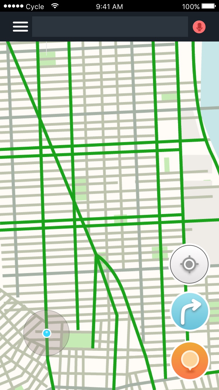
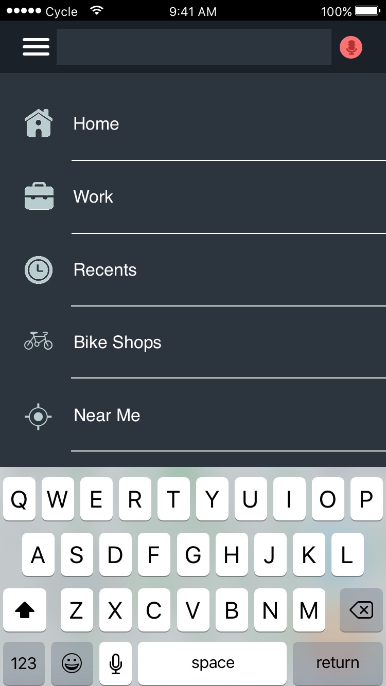
Wireframes
(Left to right) Low fidelity wire frames in order of increasing fidelity toward visual design.

Left: Iteration 1 | Right: Iteration 2

Left: Iteration 2 | Right: Iteration 3

Left: Iteration 4 | Right: Iteration 5 (current)
Prototype
Check out the prototype! If the link doesn't work, send me an email and I'll get it back up and running!


Similar Projects

NYWSE

Fandango

strand

rapid prototype